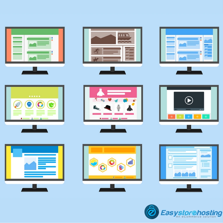
Hacks for Designing of your website
Designing an enchanting website, that captures your customer's attention and makes them stay longer is great for every eCommerce business. Make your website a visual treat to your customer, while making the website UX/UI are of great significance and make all the difference.
It is important that we give customer satisfaction and loyalty by improving the usability, pleasure, and ease of use provided by the interaction between the customer and the website the look and feel the presentation and interactivity of a website.
Using Color to grab attention:
Color can be used to focus the customers’ attention on important elements. For example, Red is the color mostly used for important or urgent things to be highlighted. It is a bright and attention-grabbing color, it stands out!
To ensure certain links are not missed, the designers need to set it against a darker background making it effectively grab attention.
Typesetting buttons:
Attention to small details is what separated an average online marketplace from a great one. Interface buttons e.g. buttons and customers click tabs on various times a day, so it plays an important role to typeset them properly. And by typesetting, we mean positioning the label. The labels need to be arranged and ordered to give a good visual feel.
Letter spacing:
Web design is quite limiting for typographers. But while we see there are only a little variety of safe Web fonts and not too many things you can do to style them. It’s worth considering that we do still have some level of control. The term used to describe it is “Tracking”, in it the adjustment of spacing between letters in words. If used with restraint and taste and smart manner, this can be effective in improving the look of your website headlines. Though it wouldn't be recommend using letter spacing on the body because the default spacing usually provides a good ability to read for smaller font sizes.
Using contrasts:
Furthermore, you can also manage the focus of your customer's attention with creating a contrast between elements. For example, you write a headline and some information underneath it regarding the author of the article and its date.
It is effective in shifting focus; the date can pop out at you, while the headline fades away. If the date is in bold letters and the heading is faded, this technique comes in very handy for information-heavy websites, in which you want to make a lot of information easily seen while still showing a lot of additional things, like dates, page no., web address. Fading the extra text allows visitors to easily focus their attention on the most important pieces of text.
There is always a chance to improve no matter how good or famous your website is, there is always a chance to improve. Treating your customers with new visual treats can help increase traffic to your website.


